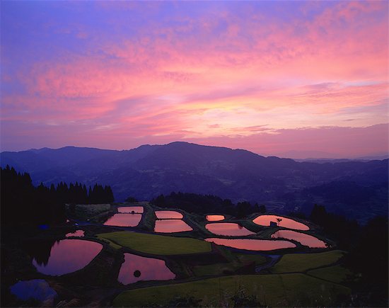
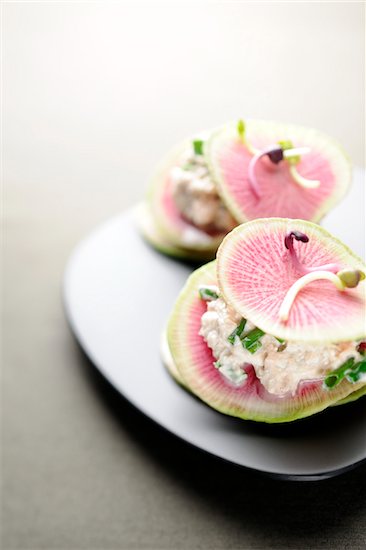
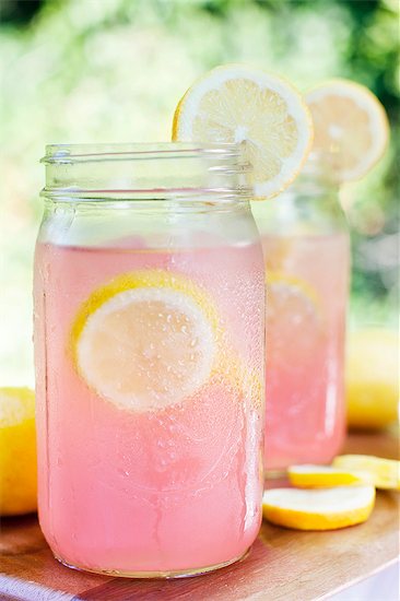
Pantone’s Spring Summer 2019 offering is a colorful one—and they may be on to something. Whether we’re talking graphic design, fashion or pattern design—all the trends point to 2019 as a year going vibrant. The latest email from a pattern provider proclaimed “color the new black” as goth fashionistas wept over their charcoal lattes. Art supply, fabric and crafting stores are always awash in color but the offerings seem more punchy these days, maybe because of the enduring love of Pinterest-worthy crafting, like knitting, quilting and jelly roll rugs. The more color, the better, to be combined at will with some kind of mad glee, completely rule-free.
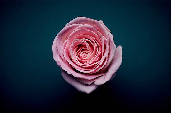
Of course, that’s the secret sauce, isn’t it? Color is hugely important for not only branding but consumer spending decisions. Unique and vivacious color combinations draw us as surely as pollinators are drawn to flowers in a garden. It’s fitting then that so many of the 12 colors Pantone has flagged are named after the natural world that inspired them, from Turmeric, a pungent orange and Living Coral, 2019’s COTY to Sweet Lilac, a classic pink and Terrarium Moss, an earthy olive green. The colors are so … electric and zippy that there doesn’t seem to be any oxygen in the room. Yeah, sure—there are four accompanying neutrals but does anyone pay attention to those, ever?
