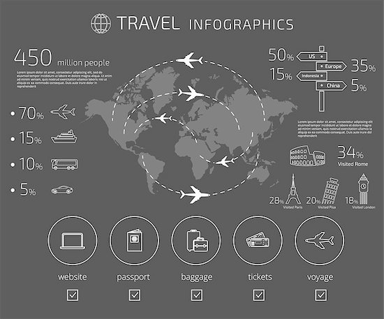
People process visuals 60,000 times faster than words, so it’s no wonder that icons and infographics have become essential for conveying information in bite-sized pieces. Whether you’re designing user interfaces for websites or mobile apps or multiple projects for a content marketing campaign like white papers, social media posts, infographics and blog posts, visuals are a must have.
Relevant images not only improve retention rates for your content but can result in 94% more views. Colorful and eye-popping graphics increase a potential customer’s willingness to read and engage with your content by 80%. From speech bubbles and pie charts to display sliders and maps as well as timelines and graphs, it takes a lot of time to create all the elements you need. It’s tempting to dive right in.
However, to create memorable infographics, you want to start with a story that’s meaningful to your audience. Spend time crafting a compelling tale and then do research to find the data to back up the points you want to include. You may be able to create your own statistics from customer data. With some careful planning, you’ll find into the best way to present the data visually, showcasing key statistics like audience size, geographic breakdown, employment figures, socio-economic or gender differences, poll results and more. You probably won’t be able to include all the data you’ve uncovered and that’s OK.
By using icon packs or infographic sets, especially those from the same artist, you get uniform elements for a more cohesive design and color palette. With a wide variety of design styles and themes, there’s something for every project. As a final tip, if you need elements that are both scalable and customizable, double-check that the images are in vector format.


