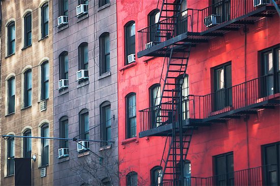
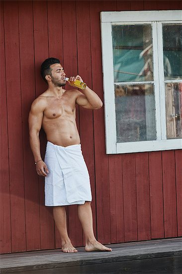
It’s summer, and we’re talking Fall/Winter trends instead of thinking about sun and sangria. But never fear, another Pantone report is here. Pantone is synonymous with global color trends and it’s no wonder—we’re always curious when they release a report. Even consumers are aware of Pantone’s color of the year and we’ve grown to expect their gurus to make regular pronouncements. So while Pantone’s on-the-ground correspondents continue to gather intel from around the world about what’s next, we can unpack the Fall 2017 colors.
Fashion Showdown: NYC v London
This time, Pantone delivers two gender neutral palettes based on, primarily, Fashion Week in two major cities: New York and London. The fashion tastes and overall lifestyles of these famous cities are frequently compared and contrasted, which makes a lot of sense: they’re both heavily urban, globally diverse, connected, fast moving and expensive. While the population is similar, the geography is not: New York is more crowded and more grid-like; London is older, with a more organic layout. As far as fashion goes, New York is street savvy, edgier yet more commercial and London is more individually experimental, quirkier and wacky.
Will you reflect or resist the zeitgeist?
Obviously, we’ll be seeing more of these colors as we move through the next two seasons. Stock photography, especially lifestyle, is influenced by the same trends, with models photographed in current threads. Stylists and photographers may deliberately choose to add popular colors thinking it will help images sell. What’s more, because everything is cyclical, we already have images featuring many of these shades. Using these colors in your visuals is a great way to inject a modern vibe into your projects.
It’s important to remember that trends are of their moment, heavily buffeted by social, economic, political and cultural waves. A unique or interesting combination of image, type, style and color is likely more important than any one hue. The fleeting nature of trends today, especially where fashion is concerned, really serves brands, enabling them to sell more clothing, rather than making any kind of statement.
However, as designers, should we care about trends? Yes—so we can embrace them or ignore them. Or something in between—if our goal is eye-catching and unique, a color that’s everywhere should be shunned, especially later in the season, when we’re sooooooo sick of it. But if we want our ads to have more of an off the cusp, documentary vibe, we can feel comfortable including more fashionable color ways. In projects with a retro vibe, look at popular colors from previous decades for a more authentic feeling, rather than relying on modern whims. Or mix it all up, because that’s where real style is born.


